Heuristics

Visibility of system standards
The system should always keep the users informed about what is going on through appropriate feedback within reasonable time.

Match between system and real world
Design should speak user’s language. It should follow real world conventions. What is understandable to you, must be the same to users.

User control and freedom
Undo and redo should be supported. Users often select certain interactions by mistake and need an immediate and clear way to exit their current action.

Consistency and standards
Users should not have to wonder whether different words, situations, or actions mean the same thing. Follow platform and industry conventions

Flexibility and efficiency of use
Provide accelerators like keyboard shortcuts and touch gestures.
Provide personalisation by tailoring content and functionality for individual users.
Allow for customisation, so users can make selections about how they want the product to work.

Recognition rather than Recall
The user should not have to remember information from one part of the interface to another. Reduce the information that users have to remember.

Aesthetic and minimalist design
Keep the content and visual design of UI focused on the essentials.
Don't let unnecessary elements distract users from the information they really need.
Prioritise the content and features to support primary goals.

Help users recognise, diagnose, and recover from errors
Error messages should be expressed in plain language, no codes.
It should precisely indicate the issue and help provide a solution for the user.
TASK
Perform a UX Audit for one of the company's products.
Generate insights off the back of this audit in order to help improve design decisions going forward.
BACKGROUND
Product is a collateral management platform used worldwide by large banks such as Danske and HSBC.
The platform was developed without the help of a design team.


Findings & Results

Summary of findings
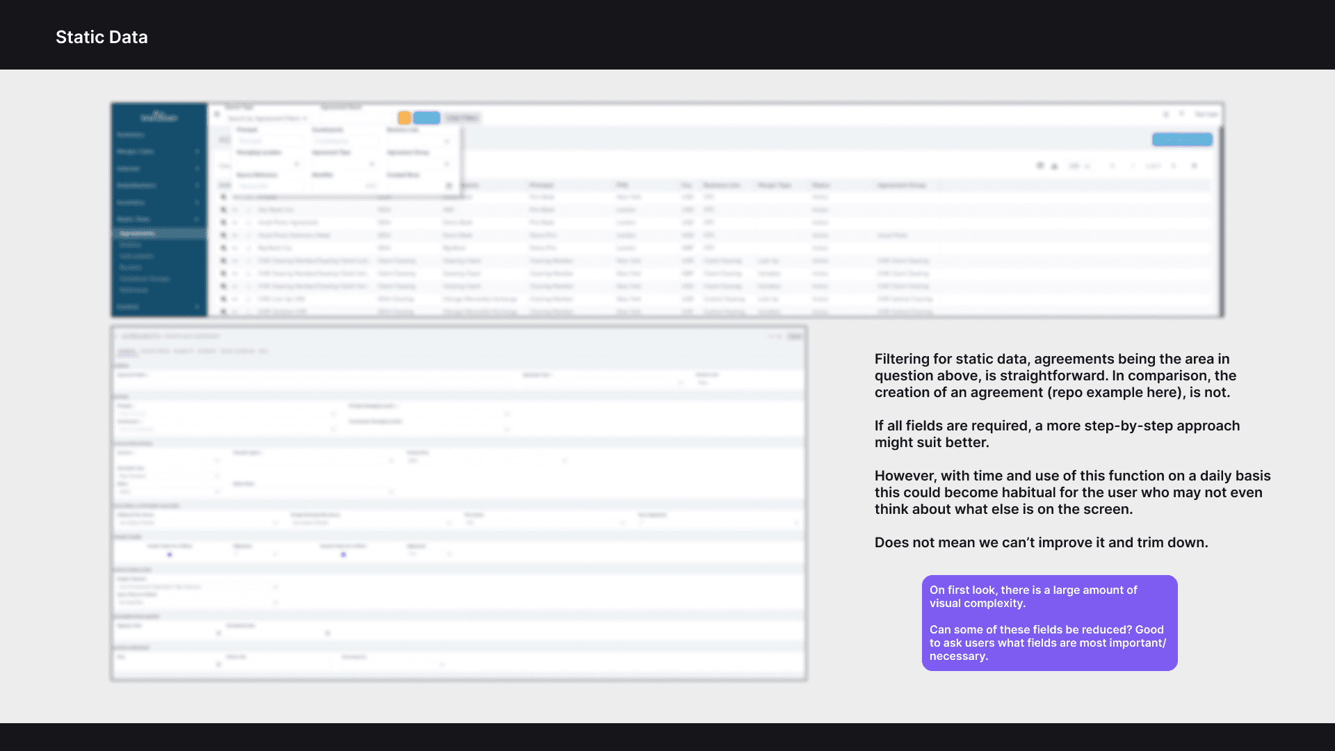
Overall the results returned quite balanced between positive and negative. With this audit being something more intended to simply aid some minor tweaks to be made, we found some really good stuff.

Strengths and weaknesses
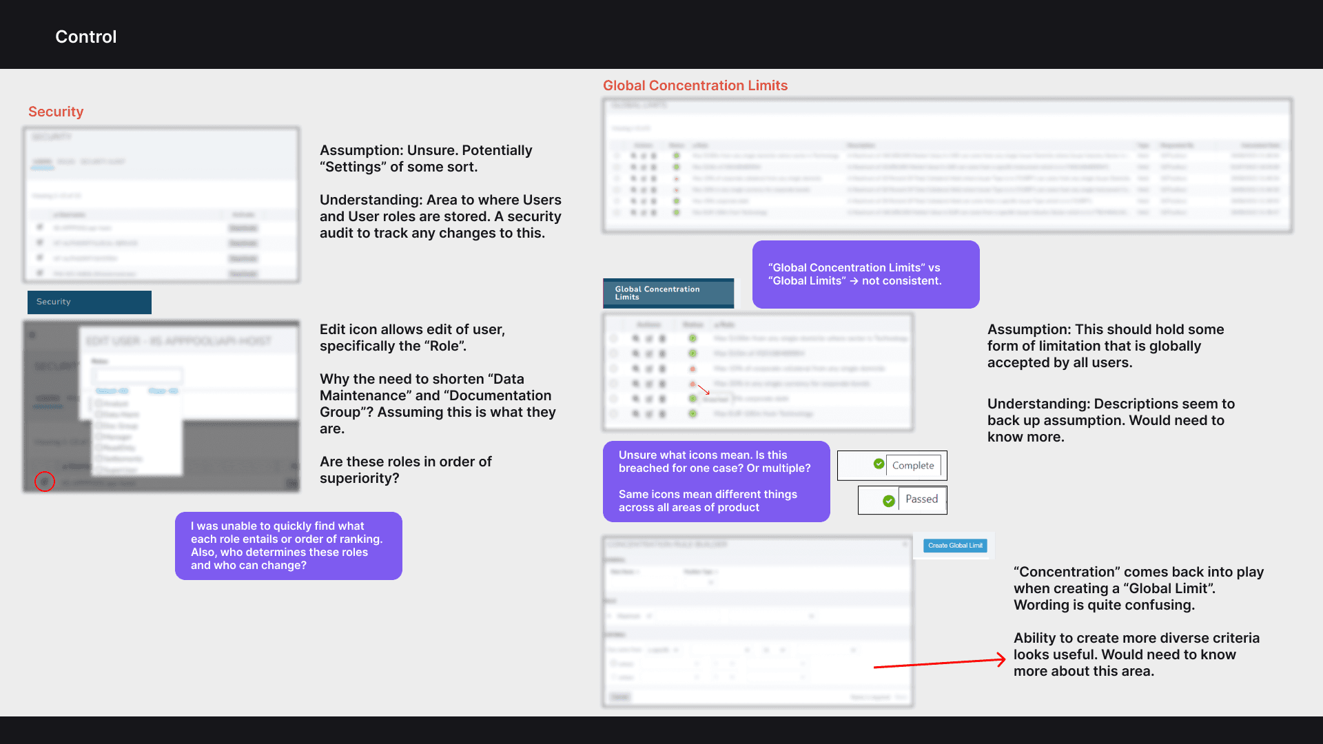
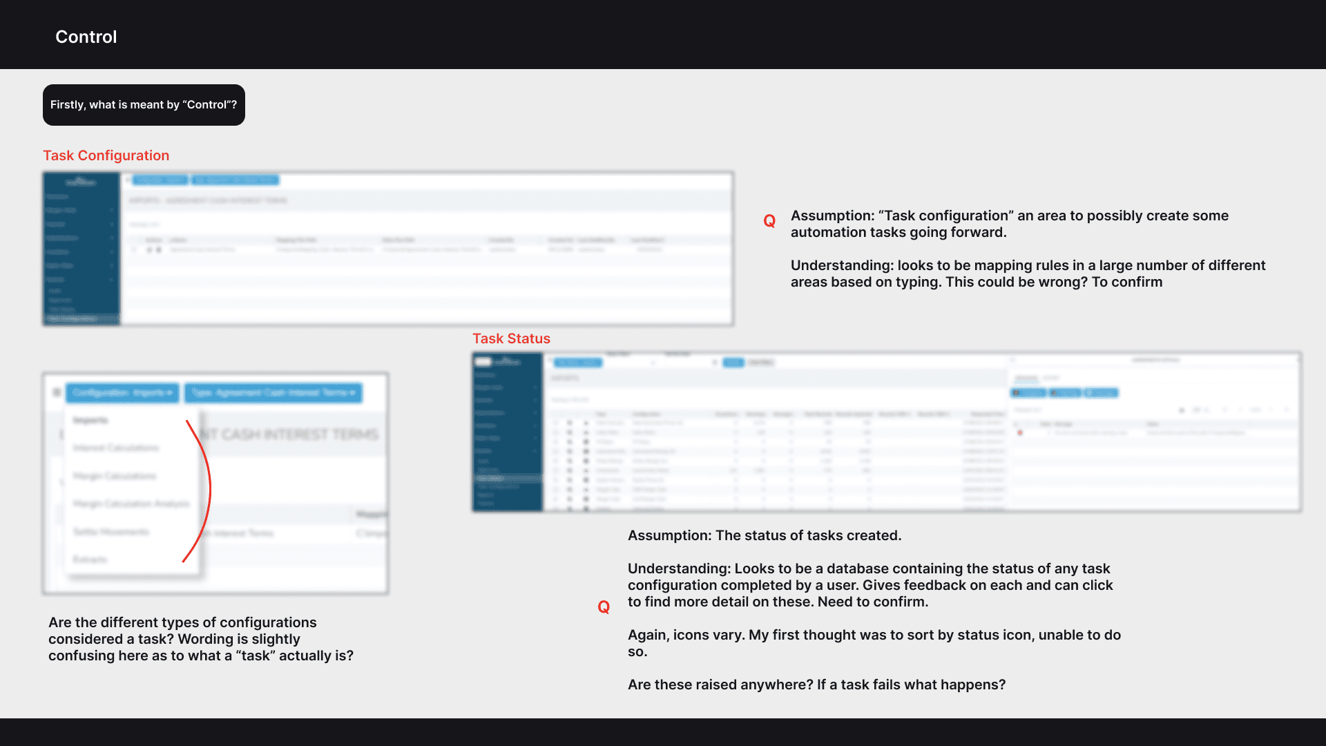
The product's core strength was its solid foundation. It provided plentiful guidance for users and incorporated beneficial features that aided in task management as opposed to memory recall.
In saying that, its primary flaws were tied to the potential that some features may be incomprehensible for the casual user. Coupled with that, there were a number of issues with user accessibility.

Accessibility issues
Throughout the audit we conducted numerous accessibility checks related to colour and contrast. The dashboard alone failed 20 contrast tests which meant people with visual impairments would find it very difficult to see text at all.


