Boarding.com
A simple, contemporary, user-friendly site enabling clients to reserve a flight devoid of the clamor of bombarding sales promotions
Timeline
Area
Role
6 months
UX Design Process
Sole student with UX design Institute
The vision
The intention behind this website's design was twofold. Primarily, it aims to facilitate a hassle-free flight booking process, and secondly, to downplay the prevalence of promotional advertisements which were identified as a key nuisance from our study.
What's the grand vision? To evolve into the topmost website for individuals seeking to reserve a flight anywhere globally. Although promotional deals contribute significantly to any airline's turnover, it is crucial that these do not become the only thing visitors associate with their experience on our platform. To set our website apart, I emphasised on enhancing the visual appeal of these offers, generating an atmosphere of thrill as opposed to annoyance.
The user problem
“I feel like it just looks like a lot of ‘ads’, which for most people would be completely unnecessary”
Throughout our exploration (discussed in greater depth later on), we found numerous problems, grievances, and potential enhancements for our competitor’s online presences.
The aviation reservation process can seem quite arduous, made worse by hidden charges and enticing deals that either overstimulate or only disclose half of the real costs.
Really we want our users to enjoy this process and progress through it effortlessly. So, how did we approach this challenge?
End product
An online platform that remains visually delightful, while integrating essential ad features and marketing deals crucial for augmenting airline businesses' income.
This digital space eliminates feelings of burden and apprehension, stimulating enthusiasm for the viewer’s imminent journey.
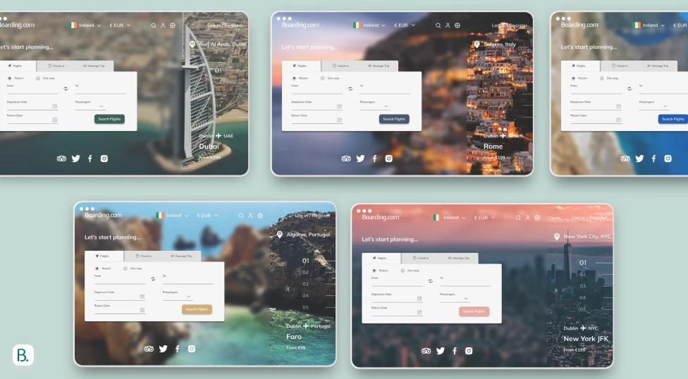
The solution
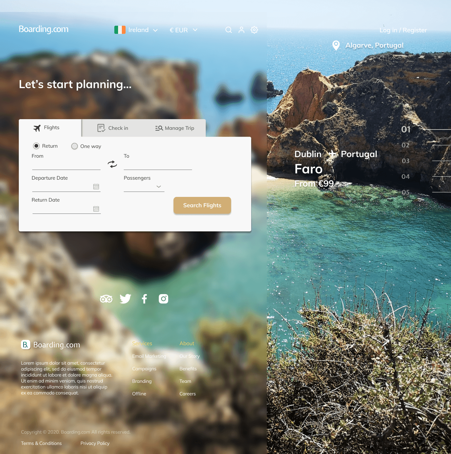
Smooth sailing
Reducing the dominance of advertisements and promotions.
Using our advertisements to create a more aesthetically pleasing back drop for the user.
Entice flight bookers with exciting images of possible destinations and the deal we have.

Refining the necessary
Introducing an interactive offer slider that is timed to display new offers and also clickable.
New offers display a new back drop for user.
If the user likes what they see they will be brought straight to the reservation page for the offer that they have selected.
How did we get here?
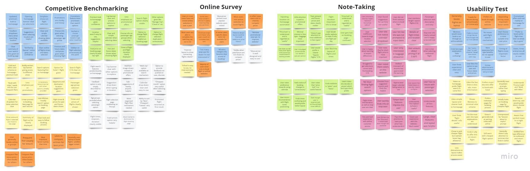
Research phase | Competitive Benchmarking & Usability Testing

Ryanair

Etihad

AerLingus
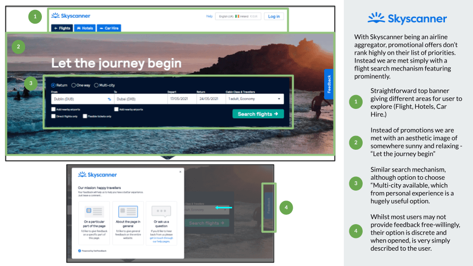
Skyscanner
Analysis
Takeaways
I put the data I collected throughout this research into three categories:
Clear feature/element
Areas for improvement
Not clear, nor useful element
A link to this research can be found here
This study was greatly informative. These aviation firms were industry leaders and shared many common tactics in their website design and layout. Usability was paramount, with their features being remarkably intuitive. While their marketing strategies varied somewhat, with Ryanair placing heavy emphasis on deals and promotions, whereas Etihad aimed at a more luxurious experience, seeming less reliant on offering discounted fares.
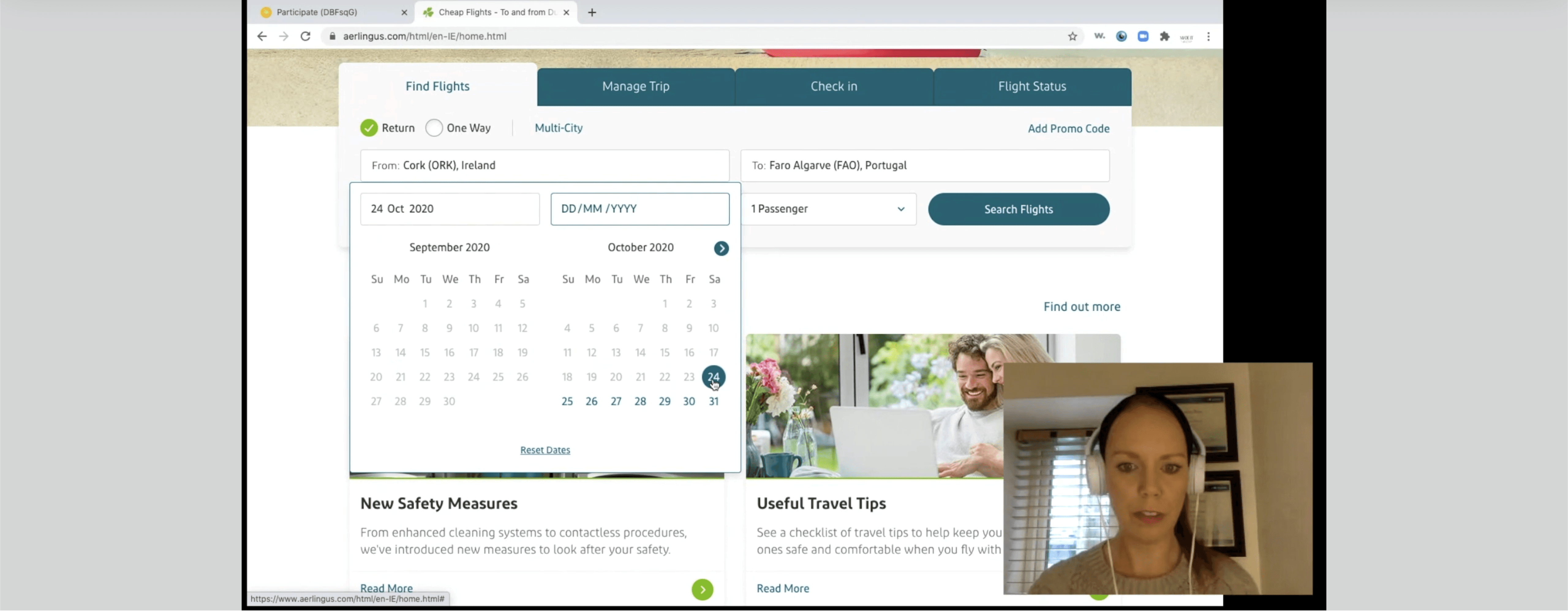
While I took in some very important points myself whilst analysing competitors, I wanted to gain insight from another user so that my thoughts were not bias.
I organised a usability test with a volunteer and went through a series of questions I formulated and tested out two of the airlines. A snippet from the usability test can be viewed below:
Online survey
I created an online survey via Google Forms and sent it out to family and friends to try and better understand the goals of users and what they are trying to do when visiting an airline’s website.
Through this I hoped to also learn what may be preventing users from achieving what they set out to do.
Targeted questions
When was the last time you visited and airline website or app?
Which airline did you use?
Why did you visit this airline that day?
Were you able to complete your task that day?
If no, why were you not able to?
What would you change about the website you used? What improvement would you make?
Did you purchase any extras (car rental, hotel) when visiting the website?
The information collected here enabled me to gain deeper insight into the objectives of the typical user. This knowledge, in turn, aided me while making more educated design choices later within this initiative. A comprehensive breakdown of the survey outcomes is accessible here.
Note taking
In order to acquire enhanced comprehension of user interaction and behaviour on websites, I personally documented observations from usability assessments implemented by the UX Design Institute.
Two separate individuals navigating two airline platforms were assigned a series of tasks, from which I marked down significant findings and notes.


This task provided valuable information and perspectives on varying user behaviors. As a young adult in the digital age, my comprehension significantly differs from say, a middle-aged housewife.
Depending solely on my personal viewpoint and experiences when navigating an airline website would be entirely insufficient, thus this task was especially beneficial during my studies. I understood the importance of conducting Usability Tests, sharpened key research approaches and skills, and utilized these in my own usability evaluation I performed.
Affinity diagram
After collecting over 100 different data points I needed to analyze and structure this data. I did this by going through all my previous research and taking notes on post-its about anything relevant to describing the user experience:
Goals
Behaviours
Pain-points
Mental models
Contextual information
Initially, I organized every sticky note, then began grouping these sticky notes into suitable categories. Subsequently, each of these categories received a label to summarise their contents.
I built this data collectively with my partner (Covid-19 restrictions at the time restricted me from collaborating with more people). This style of research aided me in sorting through large volumes of data and I also learned the power of collaborative analysis - key skills for any UX professional.
Customer journey map
Using the research we conducted via our Affinity Diagram, I moved to developing a Customer Journey Map. Here I defined the high-level steps the user takes when booking a flight and compared it against the goals of the user, positive interactions, pain points, behaviours and the mental model the user may have.

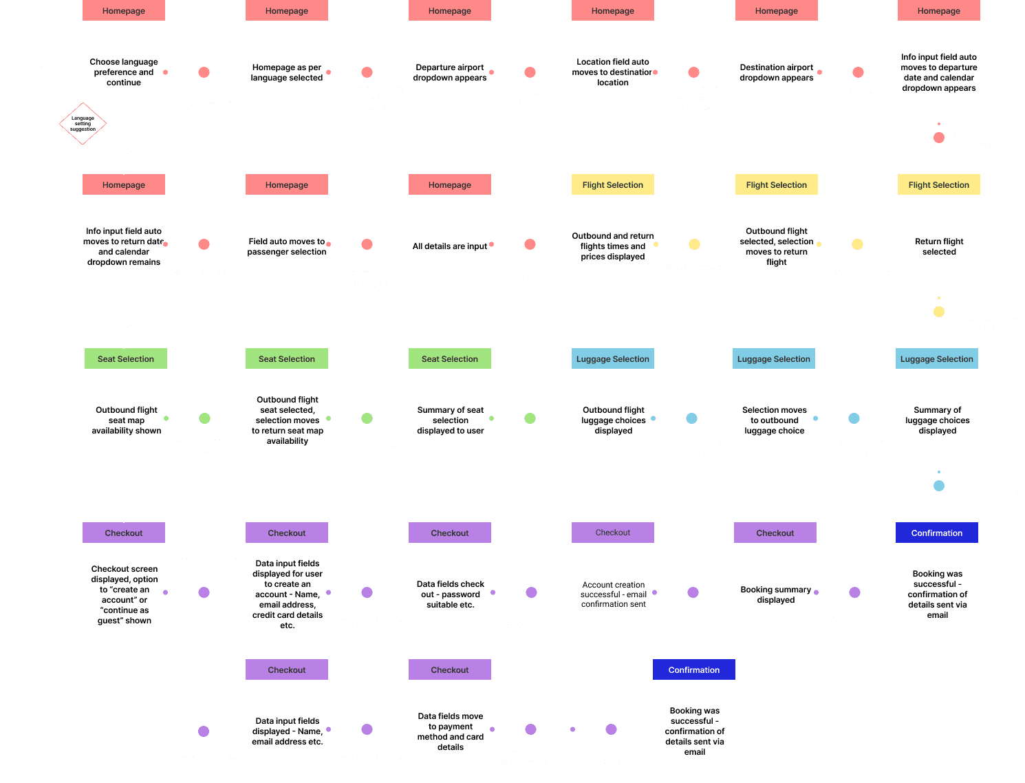
Flow diagram
As I got closer to the design of my website, I began to create a Flow Diagram. I defined a high-level flow with my overall objective being to fix problems highlighted in previous research and lay the groundwork for the upcoming design phase of the website.
The high-level flow chosen was the happy path of a user looking to book flights including all the steps in between like selecting dates, luggage, seat selection, creating an account and payment.
Design phase | Building on my ideas
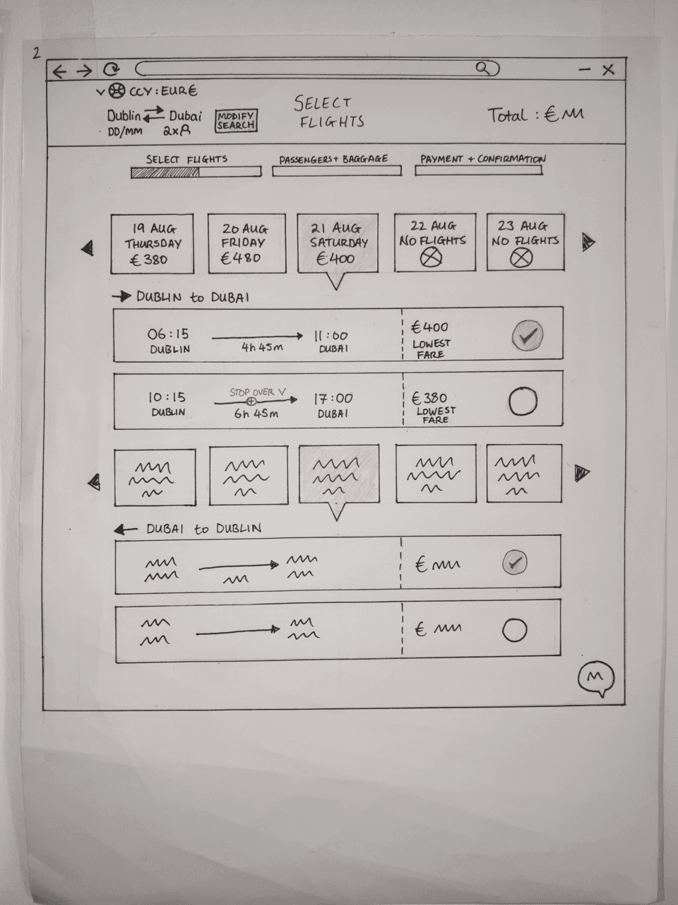
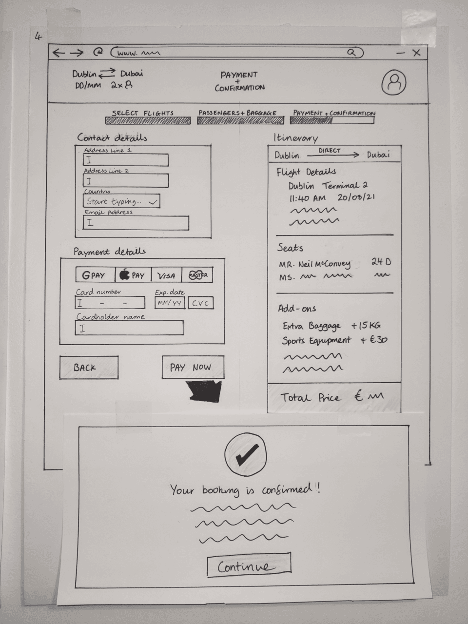
Sketched Mockups
To kick things off in this phase of the UX process, I began with developing on my user flow and sketching out the screens the user flows through. I then sketched a second state for each of these screens to show how some features would work.


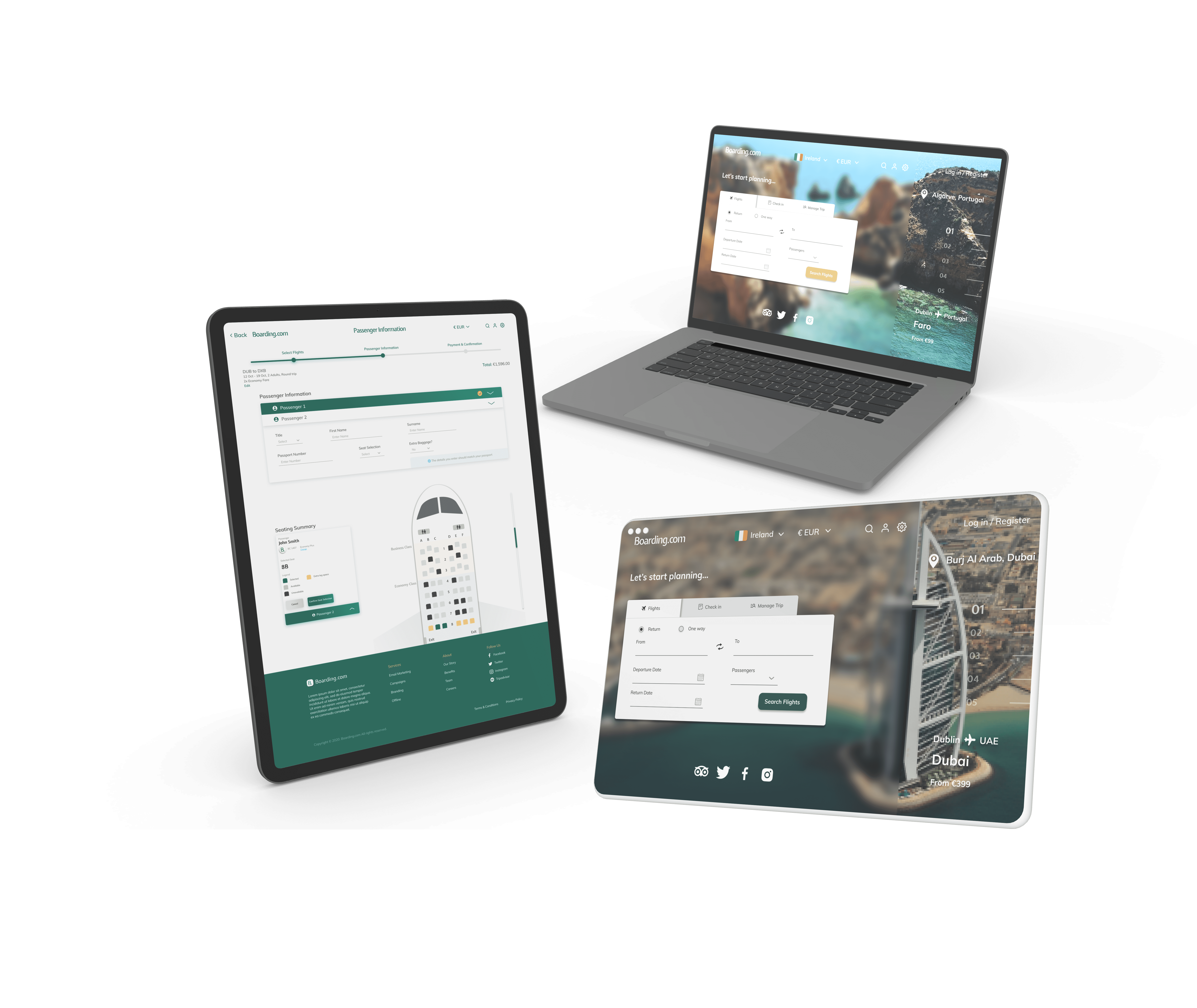
Homepage
While the homepage didn’t turn out to be the exact same as what I first envisioned in my sketches, it built the foundations.
I focused less on promotions and advertisements and placed the search function prominently in centre stage
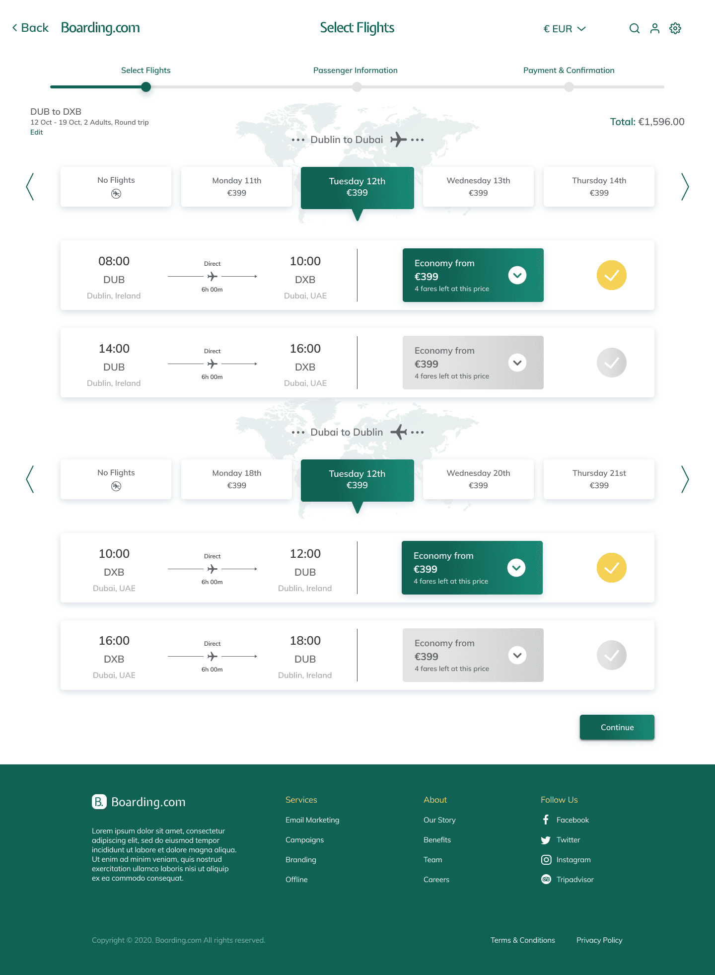
Flight selection
The flight selection sketches really helped a lot to develop the design for this page.
Featuring a carousel of date selections and a progress bar, these assets stuck with the project right the way through.


Passenger information
This page also changed marginally from the original sketches.
The basic idea is there with passengers able to input their info, select seats and add extra baggage, but the final product was a more cleaner look to it.
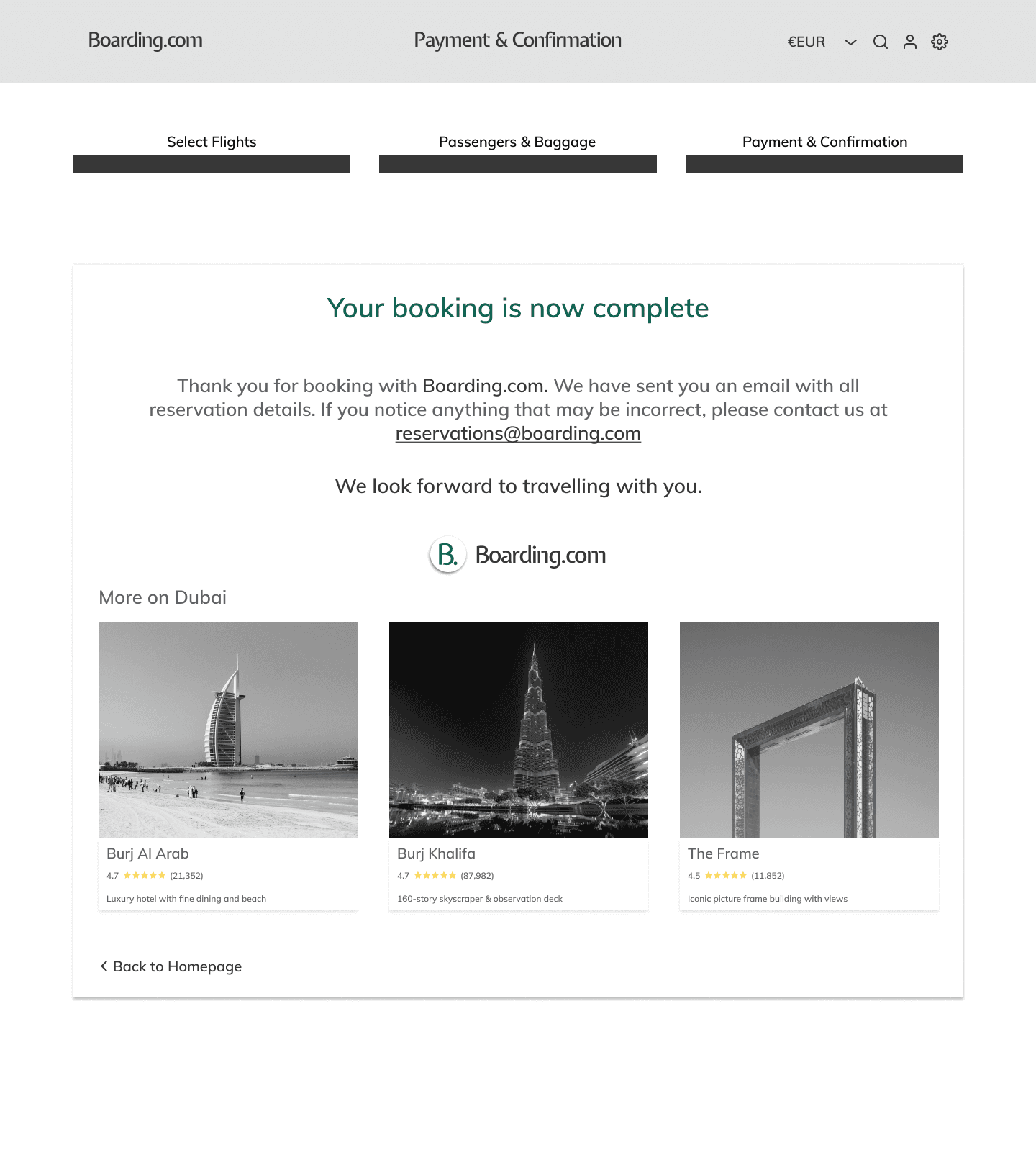
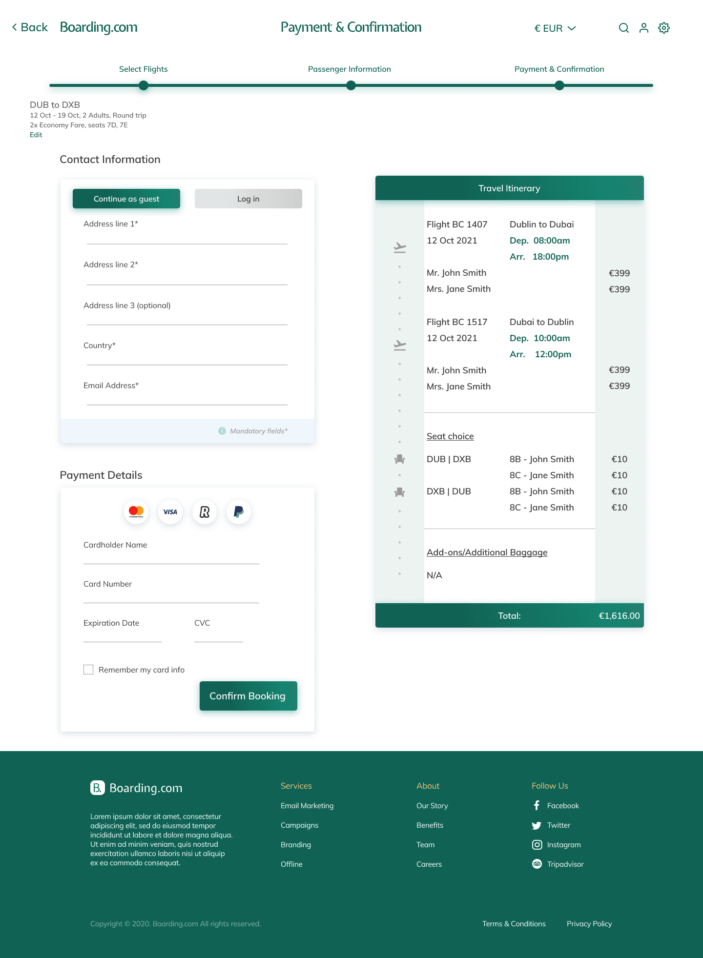
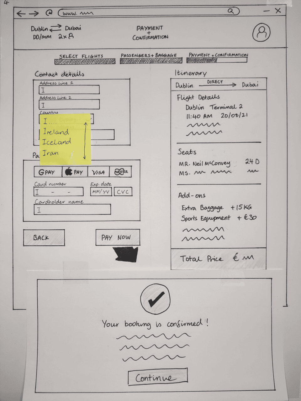
Payment & confirmation
The sketches largely provided the design for this page. Payment information on the left with flight summary on the right in a linear format.
However I decided against a pop up confirmation notification and chose a new page for the booking confirmation to make things neater.
Low-fidelity prototype


I took my sketches and developed them into a low-fidelity black-and-white design.
Using minimal colours and typography helped me to focus on the functionality and usability of the website. This part of the process was something I was very enthusiastic about. Putting my ideas into practise.